Start with the viewing distance, not the logo
Before you choose a channel letter style, work out who must see it and from where. A pylon on a busy Gauteng arterial needs a different read than a reception nameplate at the entrance to a Midrand office park. Distance, traffic speed, mounting height and background clutter all affect the final choice.
In Johannesburg, we often advise clients to think in metres, not in impressions. If people are passing within 20 to 40 metres, a well-sized non-illuminated letter set can be enough during the day. If the sign has to carry a business after dark, or compete with neighbouring tenants, illumination becomes worth the extra cost and maintenance.
- Short viewing distance: smaller letters, cleaner detail, less glare.
- Roadside or high-speed viewing: larger faces, stronger contrast, simpler forms.
- Night visibility: choose illumination, reflective surrounds, or both.
Front-lit channel letters for strong everyday visibility
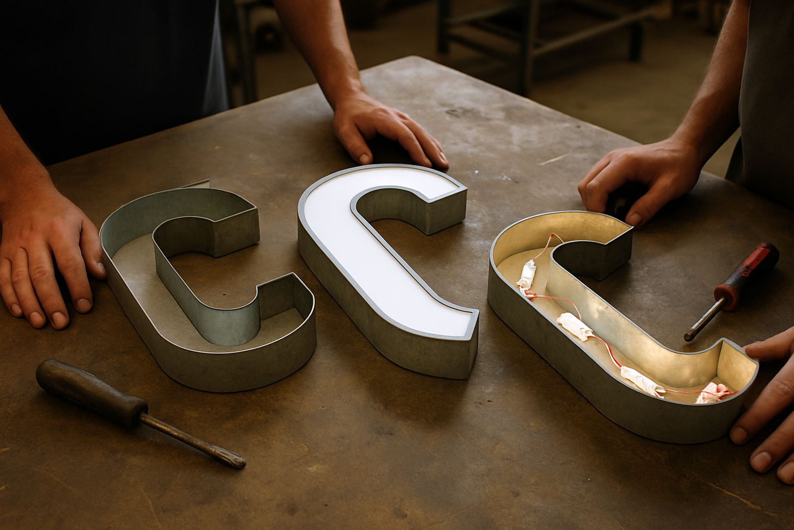
Front-lit letters are the familiar option for many retail centres, warehouses and office parks. The face of each letter is illuminated from within, so the branding reads clearly at night and in shaded positions. For most businesses that want the name visible from the car park and from the road, this is the practical middle ground.
We usually specify front-lit letters where the client needs consistent visibility without complicated effects. They suit aluminium returns, acrylic faces and sealed internal lighting. On a building in Sandton with a light-coloured facade, front-lit letters can be read cleanly even in the late afternoon when shadows start to fall.
- Best for: retail, hospitality, offices, schools and medical rooms.
- Works well on: flat walls, parapets and shopfront fascia boards.
- Consider: power access, maintenance panels and weather sealing, especially in humid coastal areas.
Front-lit letters are not always the cheapest once you factor in access equipment and electrical coordination, but they usually offer the best balance of visibility and value for trading sites.
Halo-lit letters for a softer, premium finish
Halo-lit letters, sometimes called back-lit letters, create a glow behind the sign rather than through the face. That light washes onto the wall and gives the letters a floating effect. It is a cleaner look for developments, professional suites and brands that want a more restrained finish.
This option needs a suitable mounting surface because the glow depends on the wall colour and texture. On dark cladding or a smooth painted panel, the effect is crisp. On a rough brick wall, the halo can break up and lose definition. That is why site surveys matter before anyone signs off the manufacturing detail.
- Best for: corporate entries, premium estates and controlled forecourts.
- Surface matters: dark, smooth backgrounds improve the halo effect.
- Electrical note: LED modules must be accessible for maintenance, even if the face looks simple.
Halo-lit letters are often chosen where night presence matters but the client wants less glare than a front-lit sign. They can work very well for a developer in Centurion or a professional park in Pretoria, where the signage must support the building rather than dominate it.
Non-illuminated letters for daytime clarity and lower upkeep
Non-illuminated channel letters are the straightforward choice when the sign is mostly seen in daylight, or when the site already has enough ambient lighting. These letters still have depth and presence, but they do not require internal lighting, drivers or ongoing electrical checks.
For municipalities, industrial sites and many interior courtyards, this format is often the safest and most cost-conscious option. It also handles routine servicing better because there are fewer components that can fail. On coastal projects, fewer electrified parts can mean less hassle with corrosion and moisture over time.
- Best for: internal courtyards, loading areas, municipal buildings and warehouse fronts.
- Useful when: operating hours are mostly daytime or the budget is tightly controlled.
- Finish options: brushed aluminium, painted metal, Perspex faces or mixed-material construction.
Non-illuminated does not mean plain. With the right depth, colour contrast and spacing, these letters can still carry a strong brand presence without adding an electrical load.
What to check before you approve the specification
The letter style is only part of the job. A proper specification also covers size, fixing method, wind loading, power route, access for maintenance and how the letters will sit on the structure. In Gauteng, wind can be a bigger issue on exposed rooflines than many clients expect, especially on taller facades and pylon-mounted work.
At the planning stage, we look at approvals, site conditions and the practical realities of installation. A sign that looks fine on a drawing can become costly if the wall cannot take the fixing load, or if the electrician has nowhere to terminate supply cleanly. That is why structural coordination and installation planning should happen before fabrication starts, not after.
- Confirm the wall material and fixing points.
- Check whether the site needs municipal or landlord approval.
- Allow for safe access for cleaning and lamp or LED replacement.
- Plan for load-shedding and backup power where illumination must remain on.
A practical Gauteng example: office park entry in Midrand
For a recent style discussion on an office park entry in Midrand, the brief was simple enough: visible from the road, tidy by day, and still readable after dark. The site sat behind other buildings, so the letters had to work at an angle rather than straight on. A front-lit option was considered first, but the facade already had strong external lighting and the client wanted a quieter result.
We compared that with halo-lit letters on a darker panel and found the background gave enough contrast for a clean night effect. Non-illuminated letters were ruled out because the tenant mix included late trading and after-hours visitors. The final choice came down to visibility and how much maintenance the estate team could realistically handle.
That is the point of channel letter selection: the best answer is rarely the most expensive one. It is the one that matches the site, the traffic pattern and the people who have to maintain it over time.
Choosing the right channel letter option for your site
If you need a sign to work across busy roads, after hours trading and changing weather, front-lit letters are usually the safest bet. If you want a more refined result for a controlled environment, halo-lit letters can give a strong finish without harsh brightness. If your focus is daytime identification and lower upkeep, non-illuminated letters are often the sensible choice.
The right answer depends on where the sign will live, not just what the brand looks like on paper. For projects in Johannesburg, Sandton, Randburg, Germiston, Pretoria, Centurion, Durban and wider Africa, the best results usually come from matching the letter style to the site conditions first, then refining the finish after that.