
Why office parks need more than a name on the gate
An office park is not a single sign job. It is a small wayfinding system that starts at the main road and carries through to the last tenant door. In Johannesburg, Pretoria, Sandton or Midrand, visitors arrive in different vehicles, in rain, at peak traffic and often after dark. If the site only has one gateway sign, people end up circling the blocks, stopping at the wrong entrance or phoning reception for directions.
A proper office park signage plan should reduce hesitation at every decision point. That means the driver sees the estate name from the road, the pedestrian sees the correct entrance from the pavement, and the tenant sees their unit or suite number before they reach the wrong passage. For estates with several buildings, a neat sign system also helps security, cleaners, couriers and maintenance teams move faster. Less confusion means less damage to gardens, kerbs and boom gates, and fewer complaints from tenants.
We often see the same issue in older parks around Modderfontein, Randburg and Germiston: signs added one by one over many years, each with a different font, size or fixing method. The site still functions, but it looks tired and is difficult to read. Once the sign family is planned properly, the whole park feels calmer and easier to use.
Gateway signs that carry the site from the road to the boom gate
The gateway sign is usually the first piece of real estate branding a visitor sees, so it must do two jobs. It must identify the park clearly and it must survive roadside conditions. In Gauteng that means sun, dust, summer storms and the occasional knock from a delivery truck or municipal maintenance vehicle. Near coastal areas like Durban, salt air adds another layer of wear, so fixing methods and material choice matter just as much as the graphics.
For most office parks, the best gateway signs are simple, large enough to read at speed and mounted with proper structural support. Illuminated faces help at night, while plain aluminium, composite panels or fabricated letters work well where there is no need for internal lighting. If the park is on a busy arterial road, a gateway sign should also fit with setback rules, sightlines and any estate restrictions before fabrication begins.
- Keep the message short: estate name, logo and entrance direction if needed
- Size lettering for reading from moving traffic, not only from the pavement
- Use materials that handle UV, vibration and water ingress
- Allow for maintenance access to lighting, wiring and fixings
A good gateway sign does not shout. It gives clear information, stays legible and still looks clean after a few years of Gauteng sun.
Directors, directories and tenant panels that stop the carpark chaos
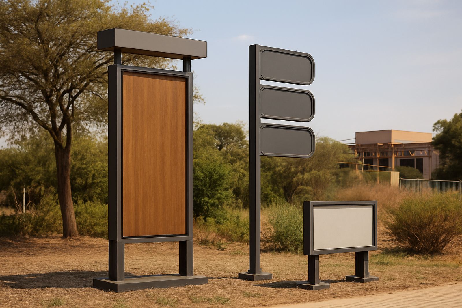
Once visitors are inside the park, the next question is where to go next. That is where directory signs and tenant panels earn their keep. A well placed directory at the main entrance or reception point lets people make the right turn before they start hunting for a unit. Inside multi building parks, stacked tenant panels and block markers should be consistent so that each business can be found quickly from the road and from the parking bays.
The trick is to balance visibility with neat presentation. Too many panels crowded into one frame become hard to read. Too few details force visitors to ask for help. Good planning groups tenants logically by building, floor or wing, then keeps the panel sizes and line heights consistent across the site. For owners, that also makes future tenant changes easier because the system is already set up for updates.
- Use one clear hierarchy for the park name, building names and tenant names
- Place directories where visitors naturally pause, not where they need to cross traffic
- Allow enough space for future tenants without redesigning the whole set
- Match fonts, colours and panel sizes across all signs on the site
In a mixed-use office park in Midrand, for example, a single entrance directory may not be enough. You may need one sign at the road, one at the boom and smaller building markers at each parking court. That layered approach saves time for visitors and security staff alike.
Building names, tenant identity and the look of the park
Building names carry more weight than many owners realise. A simple block label can become part of how tenants describe their address, how couriers find the site and how the park appears in photographs and leasing material. When building names are applied badly, crooked or in inconsistent sizes, the whole estate feels unfinished. When they are planned properly, the site feels ordered even before the landscaping is perfect.
For office parks, fabricated 3D lettering, routered Perspex, aluminium faces and brass detail all have their place. The choice depends on the architecture, the budget and the level of permanence required. A short building name on a feature wall might suit raised letters, while a long block identifier may work better as a flat panel with high contrast text. On coastal sites, brass and aluminium need the right finish and fixing details to avoid premature tarnishing or corrosion. In parks with strong glare or reflected heat, matt finishes can improve readability.
What matters most is consistency. If one building uses polished lettering and another uses a printed panel with a different font, the estate begins to look piecemeal. That may sound minor, but tenants notice it and so do prospective occupiers driving through for the first time.
Planning approvals, safety and the practical side of installation
Office park signage is never only a design exercise. There are approvals to consider, structural checks to complete and installation conditions to plan around. Municipal rules can affect height, placement, illumination and visibility from the road. Estate rules may add their own requirements, especially where the park has a body corporate, private roads or shared common property. If the sign is too close to a driveway, it can become a visibility risk. If it is too large, it can trigger avoidable delays.
Structural coordination matters just as much as appearance. A freestanding pylon, for instance, needs proper footing design, wind loading checks and a clear view of underground services before any foundation is poured. Roof-mounted names, wall signs and light boxes all need access for future maintenance. In Johannesburg and Pretoria, load-shedding has also changed how illuminated signs are planned, because backup power, timers and energy use now form part of the brief.
- Check municipal and estate approvals before fabrication starts
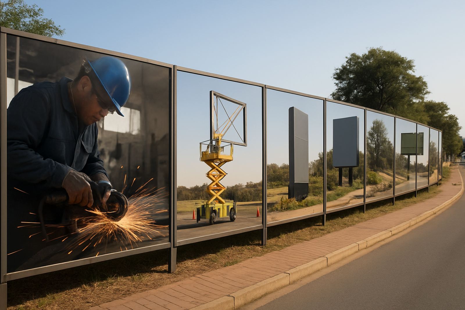
- Confirm underground services, access routes and crane or cherry picker access
- Plan for safe night work where the site cannot be closed in daytime
- Allow maintenance access for cleaning, repairs and lamp or driver replacement
A site that is approved properly on paper tends to install faster on the ground, with fewer surprises for the owner and fewer disruptions for tenants.
A Modderfontein example: making a busy park easy to read
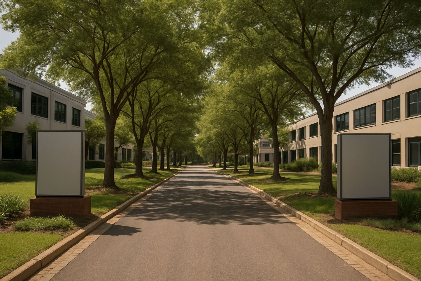
Take a typical office park in Modderfontein with three buildings, shared parking and a busy entrance from a main road. Visitors arrive from Sandton, Germiston and Midrand at different times of day, some in the dark, some in rain and some during power cuts when the entrance lighting is already under pressure. In that setting, the signage has to do more than carry a logo.
The practical solution is usually a layered package. Start with a visible gateway sign on the road edge, then a directory at the entrance that names the buildings and lists the tenants by block. Add clear building names above the doors or on feature walls, and finish with smaller directional signs for visitors parking, deliveries and security. If the park has LED screens or digital notices, those should be used carefully for announcements, not to replace the core identity signs.
The result is not decorative clutter. It is a working system that helps a first-time visitor find the right office quickly, helps tenants receive clients with less stress and helps the owner present the park as well run. That is the real value of office park signage: it cuts friction every day, even when nobody is thinking about it.
What owners should ask before commissioning office park signage
Before a park owner signs off on any sign package, the brief should answer a few basic questions. What is the site trying to solve first: arrival, tenant visibility, security control or brand presentation? Which signs must be illuminated, and which can remain non-illuminated? How often will tenants change, and how easily can panels be updated without replacing the whole system?
- Do visitors need to read the sign from the road, the parking area or both
- Will the park need future tenant updates without major fabrication work
- Are there coastal, load-shedding or vandalism risks that affect material choice
- Are approvals, structural checks and installation access already mapped out
When those answers are clear, the signage budget is easier to control and the site ends up with a cleaner, more useful result. That is what office park owners in Gauteng and across the country usually need most: signs that work hard, last well and make the park easier to use every day.