Why brass still earns its place on a sign schedule
Brass is chosen less for trend and more for the way it settles into a space. It gives a warm metal tone that reads as formal without looking harsh, and it can be polished bright or left with a softer aged finish. In commercial buildings, hotels, museums and civic spaces, that makes it useful when the sign must feel permanent rather than temporary.
It also performs well when the brief calls for detail. Engraved lettering, cut logos and border lines stay legible at close viewing distance, which is useful in foyers, reception walls and plaque applications. For projects in Johannesburg, brass often fits where there is a mix of stone, timber, glass and painted surfaces, because it holds its own without shouting for attention.
- Suitable for indoor feature signs and protected outdoor plaques
- Works with engraving, etching, infill paint and raised lettering
- Can be paired with concealed standoffs or flush fixing
- Offers a premium feel without needing large format panels
Where brass adds real value in premium interiors
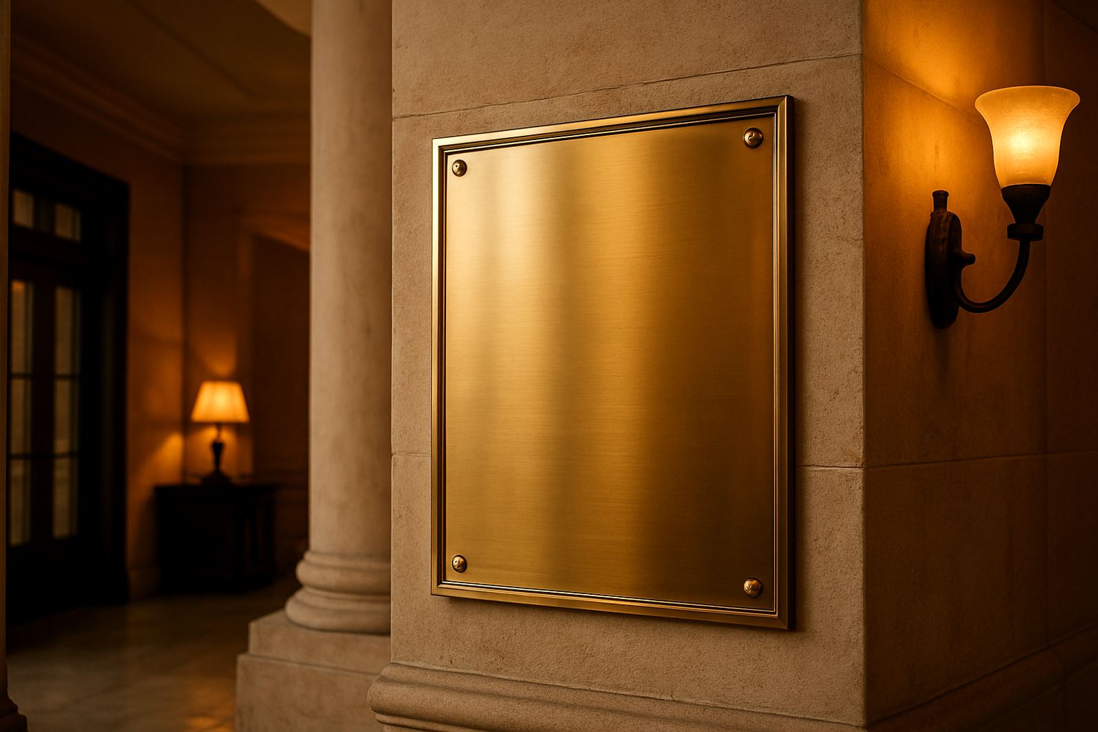
In interiors, brass is often strongest in small and medium format signs. A reception nameplate, director suite plaque, donor board or floor directory can all benefit from the metal’s finish and weight. The value is not only visual. Brass helps a sign feel intentional and can reduce the need for decorative extras elsewhere in the space.
It is also a practical choice for spaces where durability matters. In high traffic foyers, lifts and corridors, a brass sign holds up better than many printed surfaces because the face can be cleaned and maintained. For clients in Sandton, Midrand and Centurion, we often specify brass where there is a clear expectation of long term presentation and a controlled indoor environment.
- Reception branding and tenant directories
- Office suite identification and floor numbers
- Boardroom plaques and donor recognition walls
- Hospitality wayfinding with a formal tone
Brass for commemorative and memorial work
Commemorative signage is where brass has one of its strongest uses. It suits plaques for openings, dedications, jubilees, civic milestones and memorial walls because it carries a sense of formality and care. The material also accepts fine text well, which matters when names, dates and wording must remain readable for years.
For municipal sites, schools, churches and heritage properties, brass can be specified with careful edge treatment and a finish that is neither overly shiny nor too dark. That balance helps the sign sit naturally in the setting. It also allows the client to keep the wording concise and respectful, which usually produces a better result than trying to fill the plate with too much text.
- Dedication plaques for public buildings
- Memorial boards and honour rolls
- Opening plaques for developments and restored buildings
- Historic markers with controlled, formal typography
Heritage-sensitive environments need restraint, not glitter
Brass can work very well in heritage-sensitive environments, but only when the finish and fixing are handled with restraint. In older buildings, the sign should support the architecture, not compete with it. That often means smaller scale lettering, muted satin finishes, and fixing methods that avoid unnecessary damage to stone, plaster or timber.
For sites in older parts of Johannesburg, Pretoria and parts of Durban, the approval process can be just as important as the making of the sign. Heritage committees and property owners usually want to know that the plate size, wording, colour and fixing will respect the original fabric. If the sign is visible from the street, lighting and placement matter too. A brass sign can look out of place if it reflects too much sunlight or sits in the wrong position.
Good brass work in these settings often depends on a simple principle: the sign should read clearly at the right viewing distance and then quietly disappear into the architecture. That is usually the sign of a job well specified.
Finish, fixing and maintenance make the difference
The same brass plate can look refined or untidy depending on how it is finished and installed. Polished brass gives a brighter appearance, but it shows handling marks faster. Satin brass is more forgiving and often better for public buildings or indoor corporate spaces. In coastal areas such as Durban, an appropriate clear coat and regular cleaning plan are especially important because humidity and salt air can shorten the life of an untreated face.
Fixing should suit the wall material. On stone or masonry, concealed anchors or stand-off studs may be the neatest option. On timber or panelled walls, flush fixing can be cleaner. The point is to stop movement and keep the face flat. Even a slight bow or uneven spacing is visible on metal work, so the install detail needs proper attention.
- Choose satin finish for lower maintenance in busy areas
- Use protective coatings where humidity is high
- Plan the fixing method for the actual wall substrate
- Allow for cleaning access in reception and corridor areas
A Johannesburg example: brass in a mixed-use development foyer
At a mixed-use development in Modderfontein, a brass suite of signs was used for the entrance plaque, tenant directory and wayfinding markers in the main foyer. The building had polished stone floors, timber wall panels and a lot of natural light, so the goal was to add warmth without creating glare. A satin brass finish was specified, with engraved lettering and restrained logo use.
The result worked because the signage matched the building’s material palette and the scale of the foyer. The directory was readable from a distance, the entrance plate felt permanent, and the smaller directional signs guided visitors without looking like temporary add-ons. In a setting like that, brass is not used for decoration alone. It becomes part of the space’s order and clarity.
That same approach suits many Gauteng projects, especially where developers and municipalities need signs that still look correct after tenants move in and the building starts to settle into daily use.