
Start with the entry sequence, not the sign face
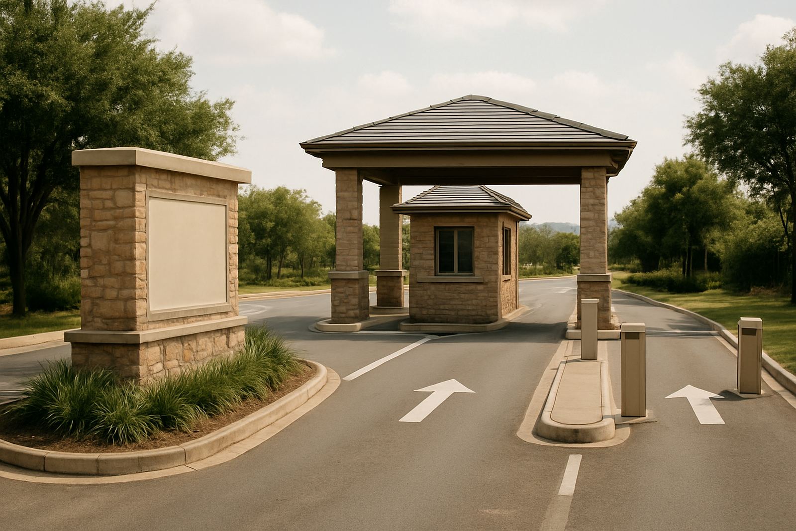
An estate entrance is a sequence of decisions. A driver sees the road approach, then the gate line, then security point, then the estate name and finally the directional information. If the signs are planned in the wrong order, people slow down too late or stop in the wrong place, which creates pressure on guards and frustration for residents and visitors.
Good entry planning starts with how vehicles, pedestrians and delivery traffic actually move. At a busy gate in Sandton or Midrand, the lane widths, stopping distance and sightlines matter as much as the lettering. A sign can look expensive and still fail if it sits where headlights hit it badly or where a boom arm blocks the name at night.
The entry should also tell visitors what to do next. That may be a clear welcome panel, access control instruction, visitor lane marker or estate identity feature that sits behind the gate line. When the sequence is right, the first 10 seconds feel calm and controlled.
Make security instructions easy to read at a glance
Security signage at estate entrances must be direct, short and highly visible. Guards need people to understand where to stop, which lane to use and what identification is required without guessing. That means fewer words, larger type and stronger contrast than most committees initially expect.
- Use one clear instruction per panel where possible, such as visitor entry, resident access or delivery reporting point.
- Place the most important message at driver eye level, then support it with secondary details lower down.
- Avoid overly decorative fonts on security instructions, especially where there is glare from dawn or evening traffic.
- Keep emergency and after-hours instructions separate from general branding so they are not missed.
For estates in coastal areas like Durban or humid inland zones after summer rain, the finish matters too. Metal parts should resist corrosion, and printed graphics need UV protection so the message stays legible after months of sun, dust and road grime.
Prestige comes from proportion, not just size
Many estate committees assume bigger signage automatically looks more premium. In practice, a sign that is too large for the boundary wall or gate pier can feel heavy and commercial. Prestige is usually created by proportion, material choice and neat detailing rather than sheer scale.
For a residential estate, a refined combination of fabricated lettering, backlit elements or a restrained monument sign can carry the identity without shouting. For a business park or mixed-use precinct, the entrance may need a stronger marker to hold its own against road traffic and competing visual clutter. The trick is to match the sign to the property class and the street context.
Material choice also shapes the tone. Aluminium gives a crisp modern finish, Perspex suits illuminated features and metal letters bring depth. In areas with strong sunlight and dust, the surface should be easy to clean and the colour should stay consistent from the road to the pedestrian gate. A premium entrance looks planned, not overdone.
Build for day light, night time and load-shedding
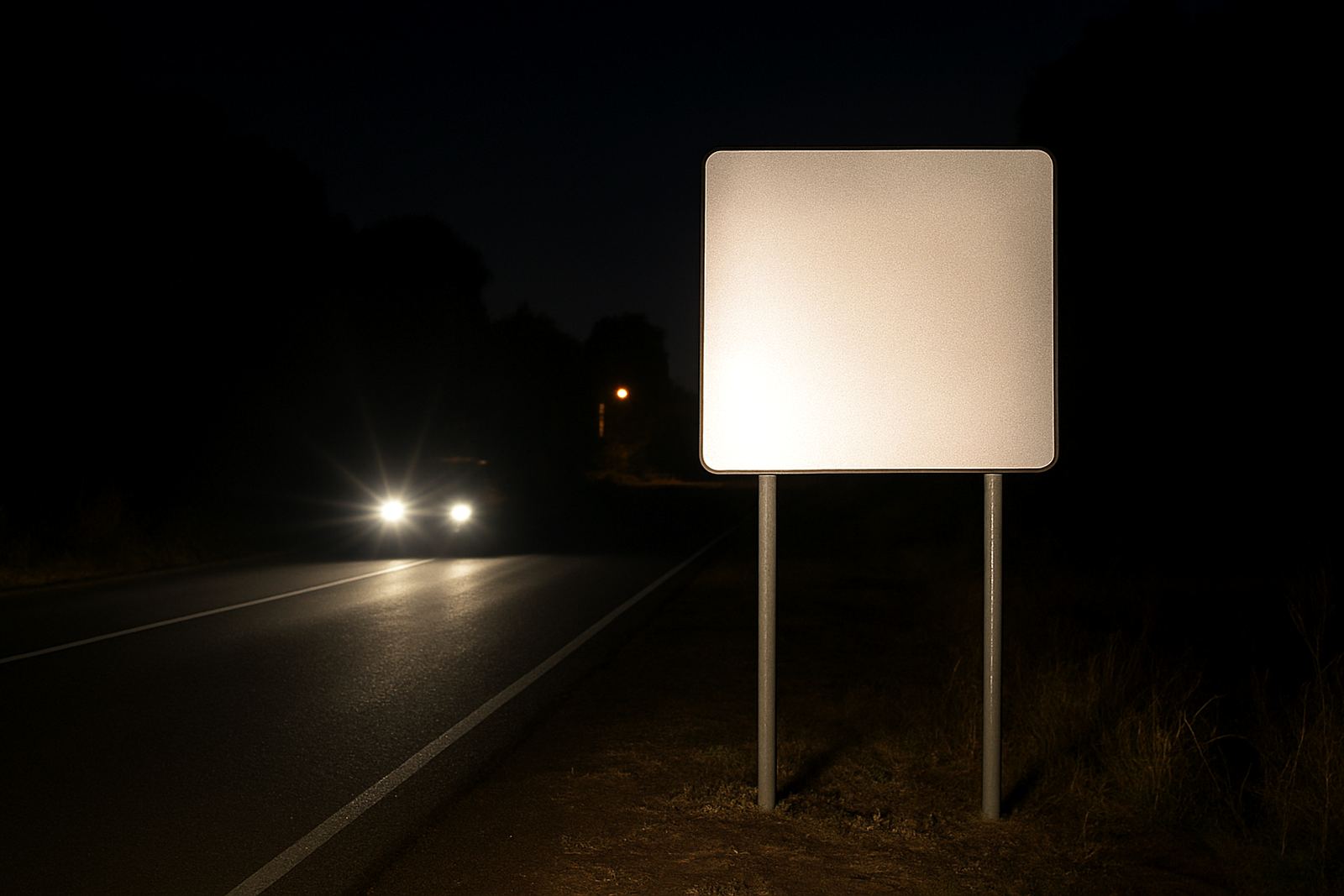
At estate entrances the sign must work in full daylight, in the early evening and during load-shedding. Many entrances look fine at noon but become hard to read after 6 pm when street lighting is limited and vehicle headlights create glare. Lighting design should be part of the signage brief, not an afterthought.
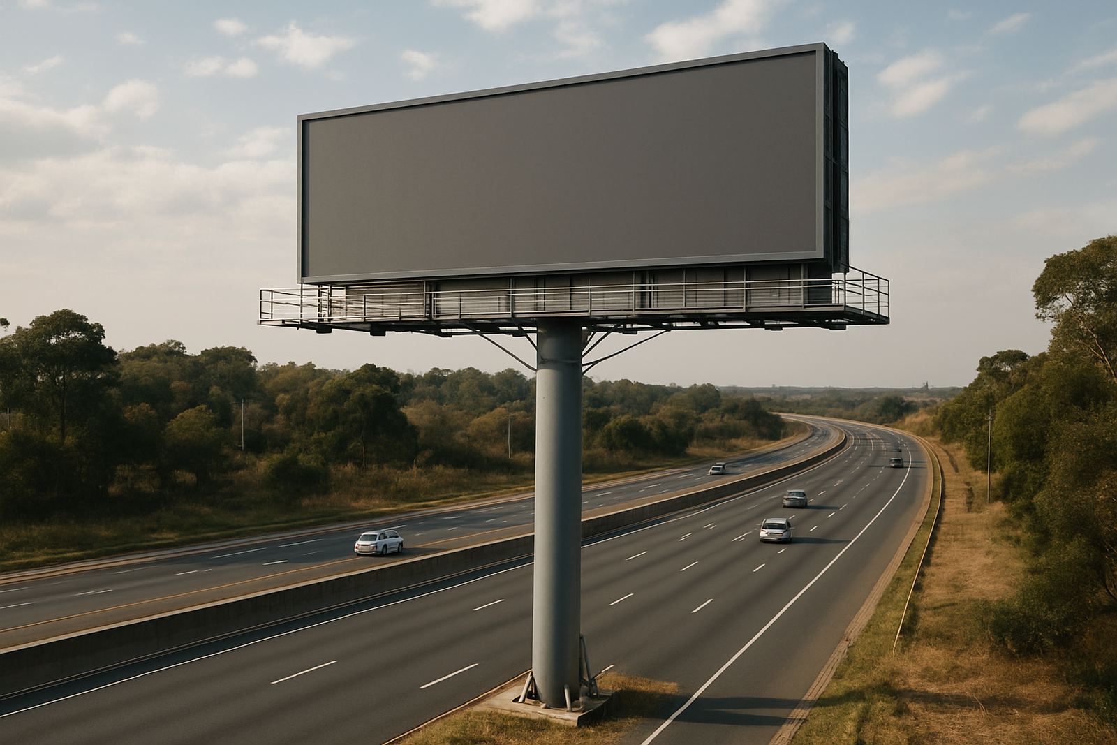
Illuminated lettering, light boxes and LED video screens can all have a place, but they need to be used carefully. The goal is not to turn the gate into a billboard. The goal is to make the name, instructions and arrival point visible every time of day.
- Choose lighting levels that help visibility without shining directly into drivers eyes.
- Check how the sign reads during power cuts and consider backup supply where needed.
- Use materials and fixings that can handle heat, rain and vibration from nearby traffic.
- Plan maintenance access so bulbs, drivers and panels can be serviced without disrupting security operations.
For Gauteng estates, especially along busier roads, this is not optional. A sign that fails at night affects safety and slows the gate process, which creates small delays that add up fast.
Wayfinding starts before the boom gate
Drivers should not reach the boom and only then realise they are in the wrong lane. Good wayfinding begins well before the gatehouse with advance direction signs, lane markers and clear numbering. This is especially useful in larger estates where resident access, visitor access and service access are separated.
Wayfinding should also support pedestrians, couriers and emergency services. That may mean a different sign size, a different mounting height or a more visible route marker from the parking area to reception or clubhouse facilities. If the entrance works only for cars, the rest of the property can still feel confusing.
One practical rule is to keep the estate name, access instructions and directional signs visually connected but distinct. The name sign should announce identity, while the smaller signs should guide movement. When all three are handled together, the entrance feels orderly and simple to use.
A Johannesburg example: calm, clear and hard-wearing
At a recent estate entry in the north of Johannesburg, the brief was to improve the arrival experience without weakening access control. The site had a high wall, two vehicle lanes and frequent visitor traffic, but the entrance branding was getting lost against the road and the guardhouse. Drivers were braking late and missing the visitor lane.
The fix combined a cleaner entry name panel, clearer lane instructions and better placement of the directional sign before the gate. The materials were specified for heat, dust and frequent cleaning, with mounting details coordinated around security hardware and the pedestrian route. The result was a more orderly entrance that felt better managed without becoming flashy.
That kind of project needs close coordination between the estate manager, security team, contractor and sign fabricator. If one element changes after approval, the whole sequence can shift. A gate boom moved 400 mm, for example, can change how a sign is seen from the road and may force a new mounting point.
What to agree before fabrication starts
Before any estate entry sign is built, the core decisions should be locked down. That saves time and prevents expensive rework on site. It also helps the committee, developer or municipality sign off with fewer surprises.
- The exact wording and spelling of the estate name, entry labels and any control instructions.
- The preferred materials, finish colours and whether the sign will be lit.
- The mounting location, height and setback from the road or boundary wall.
- Whether the entrance needs approval support, structural coordination or maintenance planning after installation.
Once those points are settled, fabrication and installation move more smoothly. For estates in Pretoria, Centurion, Randburg, Germiston or further afield, the same principle applies: good entry signage is not a decorative extra. It is part of security, movement and the daily experience of everyone who passes through the gate.