

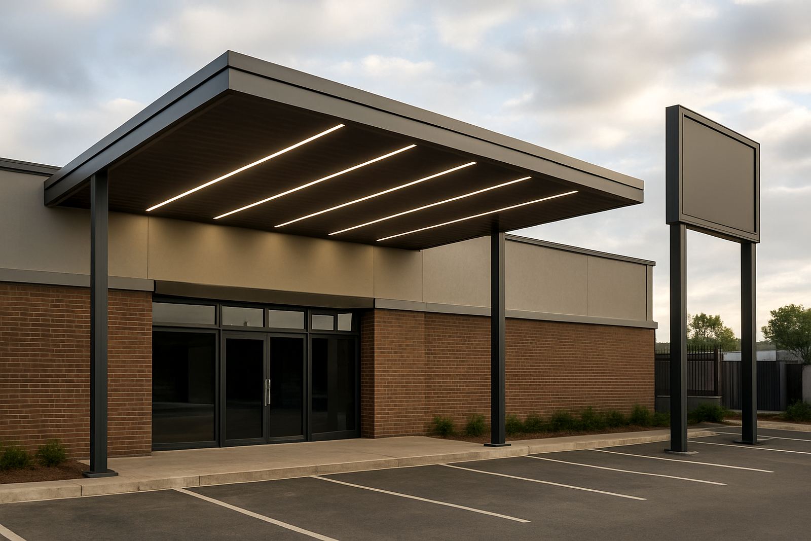
Why the parking field decides first impressions
Most retail customers do not stand in front of a fascia sign and admire it. They see it from a moving car, from a taxi rank, or while turning into a site with other vehicles around them. That means the parking field is often the true viewing point, not the pavement below the sign.
If the signage is placed too high, too far back, or squeezed behind canopies, trees or light poles, the message weakens before a customer even slows down. In busy areas like Sandton, Midrand and Germiston, the viewer may have only two or three seconds to read the name, identify the entrance and decide whether the store is worth the stop. That is not much time, so every millimetre matters.
A fascia should do three jobs at once: announce the tenant, anchor the frontage, and hold up in local weather. On the East Rand and in coastal areas like Durban, humidity and salt can affect fittings, surface finishes and illumination components over time, so visibility and durability have to be planned together.
Fascia depth changes how far the sign reads
Depth is not only a fabrication choice. It changes how light catches the face, how lettering projects, and how much the sign stands out against the building line. A very shallow sign can disappear when the sun is low or when the background wall is busy with colour and texture. A deeper fascia gives the eye a stronger edge, especially where the sign needs to be read from a moving vehicle.
For retail parks and roadside centres, depth also helps with legibility of illuminated letters and box forms. A 60 mm sign face may be enough for a simple printed panel, but a more prominent tenant name often benefits from greater build-out, sometimes 100 mm to 200 mm depending on structure, viewing distance and the mounting method. The point is not to make it bigger for the sake of size, but to give the message enough presence against the building line.
Where there are multiple tenants, consistent fascia depth can help the centre look orderly. Mixed depths without a proper layout plan can create visual noise, especially if one shopfront is recessed and another pushes forward. A clean line of fascia panels makes the retail strip easier to scan from the parking field.
- Shallower fascia: best for short viewing distances and simple name panels
- Medium depth: useful for shopfronts that need more visual weight
- Deeper build-outs: better where the sign must separate from a busy background
Illumination must work after sunset and during load-shedding
Illumination is often treated as an add-on, but for retail fascia it is part of visibility strategy. Daytime brightness matters, yet many shopping trips happen in the early evening, after work or during winter when natural light fades quickly. In South African conditions, signage also has to cope with load-shedding, so the electrical plan should be realistic from the start.
Light boxes, halo-lit lettering and front-lit sign faces each perform differently. Front-lit solutions are direct and easy to read from a distance. Halo-lit lettering creates contrast against the wall and can work very well where the building finish is clean and simple. Light boxes are useful when the fascia needs a uniform glow across a larger surface. The right choice depends on the tenant name, the building depth, and the amount of ambient light in the parking area.
Illumination should not fight with the environment. Too much glare can wash out the face, while weak light turns the sign grey and flat. A good setup considers bracket position, internal spread, access for maintenance, and the effect of nearby street lighting. In places like Pretoria and Centurion, where retail nodes often have mixed public lighting, a fascia can appear dim even when it technically has power. That is why testing at dusk matters.
- Check the sign at midday, at dusk and after full dark
- Allow for generator, inverter or backup supply needs where required
- Use maintenance access that does not interrupt trading or parking flow
Placement is about angle, height and approach speed
Placement is not only about where the sign fits on the building, it is about where the customer is coming from. A driver entering from a main access road needs different sightlines from a pedestrian approaching from the parking field. The fascia must sit within the natural cone of vision, not above it.
Height matters because too high can make the message feel disconnected from the entrance. Too low can put the sign behind parked vehicles or delivery trucks. Angle also matters on corner sites and angled façades. A sign that faces the road but not the entrance may look fine from a surveyor’s tape measure, yet still miss the real approach line. Sometimes a slight shift of 300 mm or 500 mm can improve the view more than making the sign larger.
For retail centres with multiple entrances, the main fascia should support the route most customers actually take. If shoppers park at the side and walk in through the rear entrance, the side elevation may need stronger treatment than the road-facing elevation. This is where site surveys and wayfinding planning become practical tools, not paperwork.
Local example: a Midrand retail frontage with limited space
Consider a retail tenant in Midrand with a narrow frontage, a shared parking field and a canopy that already sits low over the shopfront. The landlord wants visible branding from the access road, but the tenant also needs clear reading from the bays closest to the entrance. In that setting, a flat sign panel alone is rarely enough.
A better solution might be a deeper fascia with raised lettering, front illumination for evening trade, and a carefully set mount line that clears the canopy shadow. If the parking layout forces customers to approach from the left, the designer may widen the visual field by extending the sign face within the permitted boundary rather than pushing the height upward. On sites like this, structural coordination is just as important as the visual idea.
The same site may also need approval support if the centre manager or municipality has height, projection or electrical conditions. The earlier those matters are addressed, the easier the installation becomes and the less chance there is of rework on site. That saves time, cost and frustration, which matters when a store is trying to trade through a busy season.
What good retail fascia planning should include
A fascia should not be designed in isolation from the rest of the centre. The best results come when the visual plan, structure, materials and maintenance plan are handled together from the start. That is especially true for brands with multiple branches in Gauteng, where the same identity must work across different building types, tenants and parking layouts.
For practical planning, the following points should be confirmed before fabrication begins:
- Exact viewing distance from the parking field and access road
- Available fascia depth, projection limits and fixing points
- Lighting method and power availability, including backup provisions
- Material choice for sun exposure, dust, rain and coastal humidity
- Access for cleaning, lamp or LED replacement, and future repairs
When these details are known early, the sign has a better chance of doing its real job, which is to get noticed quickly and read correctly. That is the difference between a fascia that merely fills a wall and one that helps a customer find the entrance without hesitation.
From first survey to final handover
Retail fascia visibility is rarely fixed by one feature alone. Depth, illumination and placement work together, and each one changes how a sign performs from the parking field. A sign that looks bold on a drawing can still fail if it sits in the wrong plane or loses brightness after sunset.
For centres, developers and municipalities, the safest route is to start with a site survey, confirm the viewing angles, then develop the sign around the actual conditions on site. That includes structural coordination, approval support where needed, fabrication management, installation management and a proper handover so the client knows how to maintain the asset.
When the planning is done properly, the fascia becomes more than a name panel. It becomes the first clear point of contact between the customer and the store, whether the site is in Johannesburg, Pretoria, Randburg or Durban.