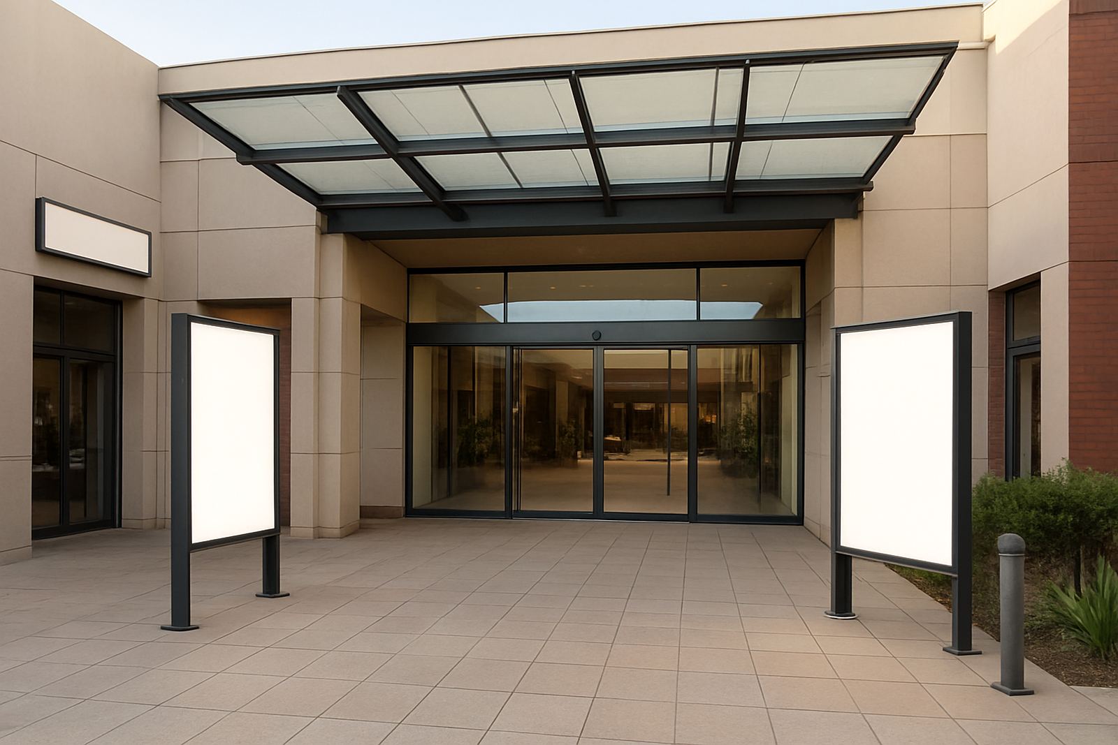

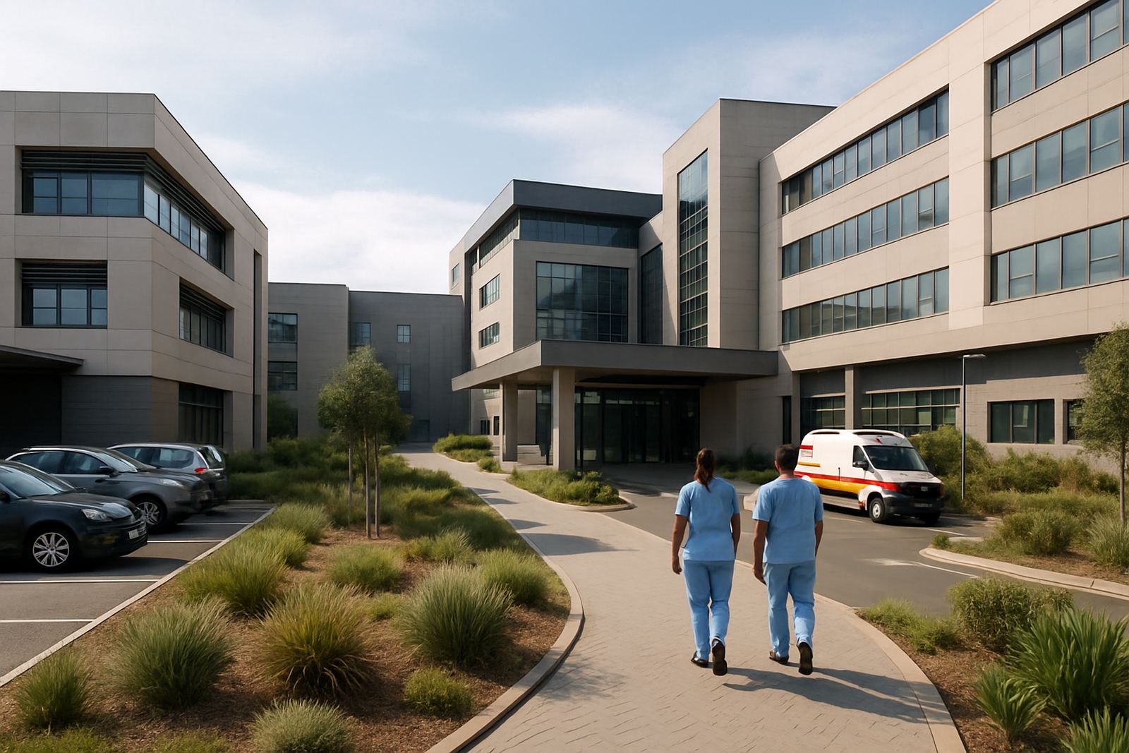
A campus with high footfall and no room for confusion
The client was a private medical campus in Pretoria serving outpatients, specialists, visiting doctors and emergency vehicles. The site included consulting rooms, shared parking, multiple entrances, drop-off points and service access that all had to be understood at a glance. In a healthcare setting, a wrong turn can cost time and increase pressure on staff, so the signage had to work harder than a normal commercial project.
The main brief was to make movement simple from the boundary wall to each clinic reception, while also strengthening the overall identity of the campus. We were asked to coordinate the full package from survey and planning through to fabrication management and installation, with signs that could cope with strong sun, winter cold mornings and the dust that builds up on exposed panels. Pretoria also brings frequent load-shedding, so the non-illuminated signs had to stay legible without relying on power.
- Client type: medical campus with clinics, consulting suites and emergency access
- Town: Pretoria, Gauteng
- Main need: fast wayfinding for patients, staff and ambulance movement
- Priority: clear identity from the road and at pedestrian level
Site survey, routes and approval coordination
We started with a detailed site survey across the entrances, parking aisles, stair cores and covered walkways. The campus had more than one arrival point, which meant the sign hierarchy had to be mapped carefully. We identified where people actually stopped, where they made decisions, and where sightlines were interrupted by trees, vehicle movement or building corners.
Because medical facilities often require stricter internal sign placement and access control, we also worked around approval needs for emergency routes, fire lanes and tenant identities. The planning stage covered pedestrian wayfinding, vehicle direction signs, door identification, parking bay marking and external building nameboards. We kept the wording short and direct, since visitors in stress do not read long messages.
- Surveyed the site in phases to check line of sight from the road, entrances and lifts
- Mapped decision points for visitors arriving by car, on foot and by ambulance
- Prepared approval drawings for campus management and tenant coordination
Materials chosen for Pretoria weather and daily cleaning
We specified a practical mix of printed vinyl, aluminium, Perspex and fabricated lettering, selected for durability and easy maintenance. For external signs, aluminium composite panels gave a stable base and clean edges, while routered Perspex was used where a crisp internal finish was needed. The building identity signs needed to stay readable through glare, so we used high-contrast colour layouts and controlled gloss levels rather than over-polished faces.
In healthcare environments, signage must hold up to routine cleaning and repeated contact, especially around entrances and waiting areas. We allowed for wipe-downs, dust and the occasional impact from trolleys or bags. Fixings were planned so signs could be removed or serviced without damaging surrounding finishes, and so replacement panels would be straightforward if tenants changed. The result was a spec that balanced cost, lifespan and maintenance access.
- Aluminium composite for external wayfinding and name panels
- Routered Perspex for internal room IDs and directional markers
- Printed vinyl for arrows, legends and window graphics
- Fabricated 3D lettering for the main building identity
What Deep3 supplied and how the signage was made
We managed the fabrication package for the full sign set, including building identity signs, parking directionals, clinic identification, emergency route markers and internal room labels. The campus required a clean visual system that could be repeated across multiple buildings without becoming confusing. Our design and visualisation lead developed consistent layouts for fonts, arrow styles, colour blocks and numbering so each sign looked like part of one system.
Riaan and the fabrication team coordinated production details such as panel thickness, edge sealing, drilling positions and fixing methods. For the larger external pieces, we planned rigid supports and mounting that would suit wind exposure and long-term alignment. The project also included preparations for possible future additions, because medical campuses often expand or reconfigure tenants over time.
- Building identity signs at key entrances and reception approaches
- Directional signs for parking, lift access and specialist suites
- Emergency route identification with clear access wording
- Door and room numbering for visitors moving between clinics
- Artwork and layout files prepared for future sign additions
Installation over four weeks with live-site control
The works were completed over a four-week programme, with installation sequenced to limit disruption to daily operations. We started with the external identity and parking signs, then moved into the pedestrian wayfinding and internal identification once the main routes were in place. That order mattered because the campus could not have areas closed off for long, and patient access had to remain open throughout.
Omolemo coordinated site rigging and installation timing around quieter periods, clinic arrivals and deliveries. We also checked each sign after fixing to make sure arrows pointed correctly and room numbers matched the latest floor use. On a live medical site, a small error can send someone to the wrong wing, so we treated final checking as a proper step, not a quick glance. Where surfaces were uneven or existing services were in the way, we adjusted the fixing detail on site rather than forcing a bad fit.
- Week 1: survey, route mapping and approval drawings
- Week 2: material specification and fabrication release
- Week 3: external sign installation and campus directions
- Week 4: internal wayfinding, final checks and handover
Results for patients, staff and emergency access
Once the system was in place, the campus became easier to move through from the first point of arrival. Patients could identify the right building and parking area sooner, while staff had clearer route markers for everyday movement and visiting teams. Emergency access wording was also more visible, which helped reinforce the correct vehicle routes and reduced the chance of informal parking blocking key access points.
The visual identity of the campus improved as well. Rather than a mix of signs added over time, the property now reads as one planned medical environment with clear hierarchy and controlled messaging. That matters in Pretoria where a campus can have to serve both public-facing pedestrian traffic and fast vehicle movement in the same hour. It also means future tenants can be slotted into the system without starting from scratch.
- Clearer first-time navigation for visitors and patients
- Better separation of public parking and emergency access routes
- More consistent building identity across the campus
- Lower maintenance risk through durable, easy-clean materials
What we would repeat on a similar campus
For a site like this, we would use the same approach again: survey first, simplify the route logic, then specify materials that suit Pretoria sun, dust and regular cleaning. We would also keep the sign family tight and practical, with fewer styles and stronger consistency. That makes it easier for visitors to follow, and easier for the property team to maintain after handover.
If the campus expands in future, we would build in room for additional clinic names, parking bays and access markers without changing the core system. The important lesson from this project was that healthcare signage is not just about labels. It is about getting people to the right place quickly, with as little stress as possible, and making sure the campus stays legible when it is busy. A well planned system saves time every day.