Start With the Viewing Distance and the Site Conditions
Before you compare materials, look at where people will see the letters from. A reception wall in Sandton needs a different solution to a roadside façade in Germiston, and a retail pylon in Midrand has different viewing rules again. If the sign is close to the viewer, smaller letter depths and cleaner finishes can work well. If it must carry weight on a large building or be read from moving traffic, the size, projection and lighting strategy become more important than the font style alone.
Site conditions matter just as much. Coastal humidity in Durban can affect fixings and surface finishes, while rooftop installations in Johannesburg often need stronger structural checks because of wind uplift and access limits. In some municipal areas, approval details, setback lines and night visibility rules must be considered early. A good sign choice starts with the site, not the material catalogue.
Quick check:
- How far away will the sign be read?
- Is it for indoors, outdoors, or both?
- Will it face direct sun, rain or coastal air?
- Does it need to work during load-shedding?
- Will the building owner need approval drawings or council submission support?
Acrylic Letters: Clean, Precise and Good for Interior Control
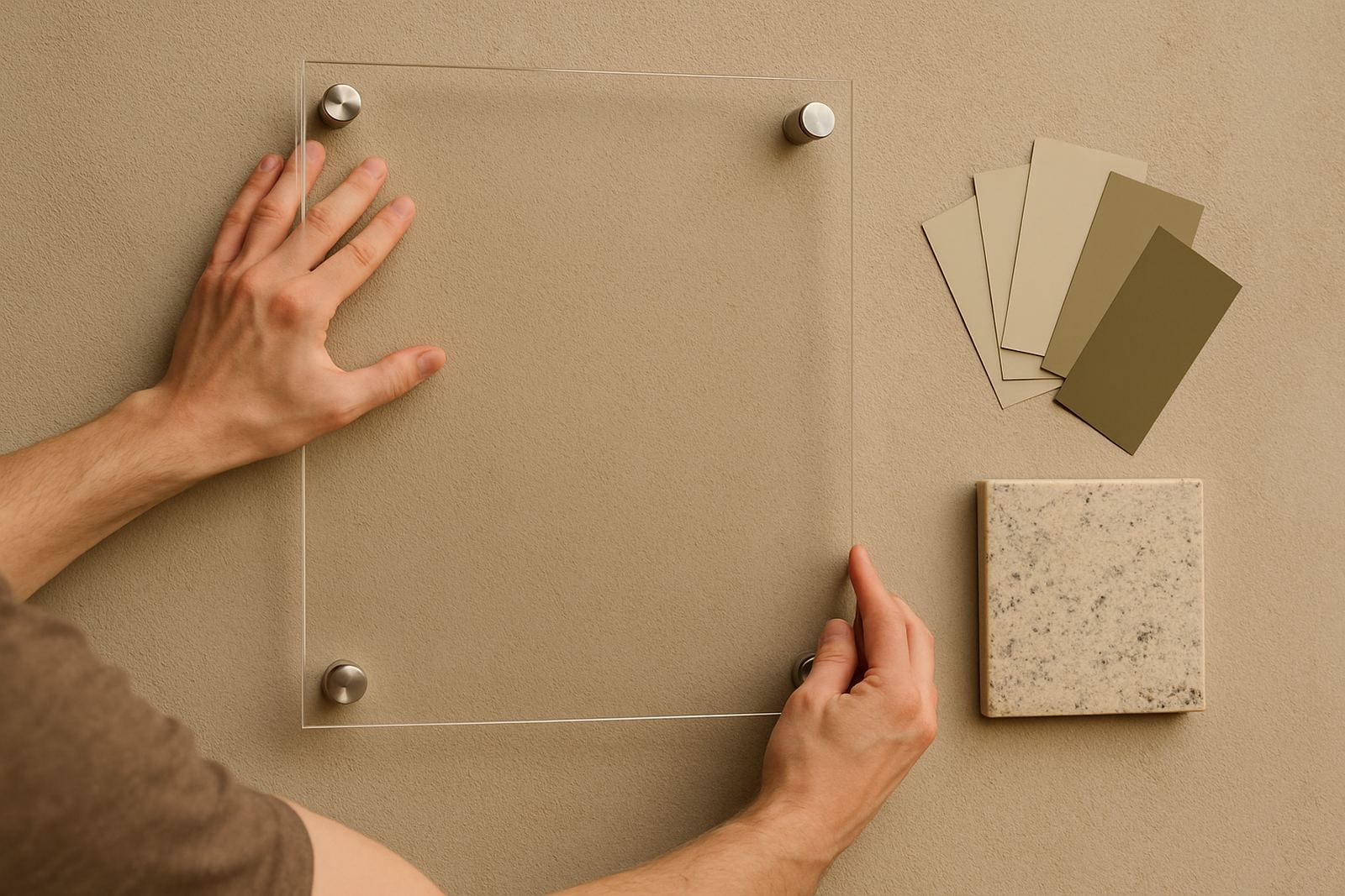
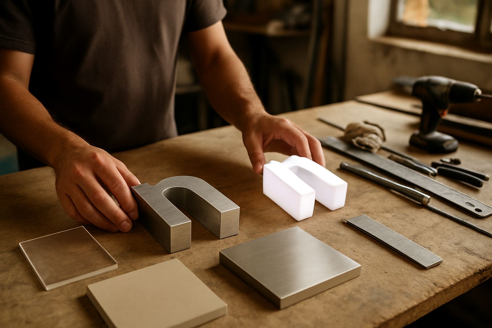
Acrylic letters are a solid choice when you want a crisp, modern look with accurate edges and consistent colour. They are often used for office lobbies, reception walls, showrooms and tenant directories. Acrylic gives a neat finish and can be cut into fine shapes, which makes it useful for logos with detailed contours or smaller type. It also works well when the wall finish is smooth and the sign needs to sit neatly under lighting.
For interiors, acrylic is usually easy to keep clean and it does not need heavy structural support. On exterior walls, though, it needs proper backing and careful fixing, especially where heat, sun and wind can affect the installation over time. If the sign is going into a public-facing space with high traffic, consider how the letters will be handled during maintenance and whether the surface can be cleaned without marking.
- Best for reception areas and indoor brand walls
- Works well for smaller to medium size letter sets
- Can be used with standoff mounts for depth
- Needs the right fixing method outdoors
- Good option when clean colour matching matters
Aluminium Letters: Stronger for Outdoor Exposure and Larger Scale
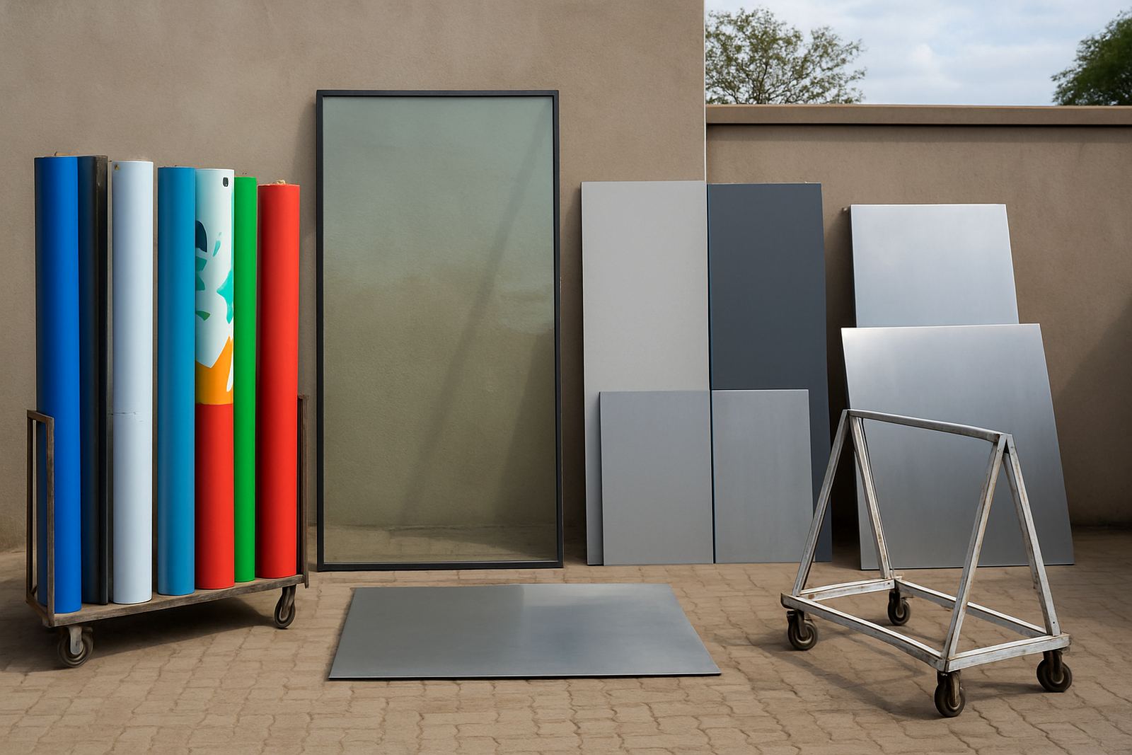
Aluminium letters are often the better choice when the sign must last outdoors and hold its shape on a larger façade. They suit corporate buildings, schools, industrial sites, medical facilities and municipal sites where durability matters. Aluminium can be finished in painted colours, brushed looks or paired with other face materials depending on the effect required. It is also a practical option where the sign is exposed to sun, rain and day-to-day wear.
For bigger projects, aluminium gives you more confidence in structural performance. That matters on higher walls, parapets and freestanding signs. It also helps when the letters need to be fabricated to a specified depth and mounted with tidy spacing across long runs. If the site is near the coast or in an area with stronger weather exposure, aluminium generally gives better peace of mind than lightweight alternatives.
It is still important to check the wall construction, fixing points and access method. A well-made letter can still fail if the mounting surface is weak or the installer is forced to work around poor access. That is why structural coordination and installation planning should happen before fabrication starts, not after.
Illuminated Letters: When You Need Day and Night Visibility
Illuminated letters are used when the brand must stay visible after dark or when the site needs stronger presence from the road. This can include front lit, halo lit or a combination of both, depending on the effect and the building finish. For many developments, illuminated letters are the best answer for trading hours that stretch into the evening, and they are especially useful where security lighting and sign lighting need to work together.
If your site is affected by load-shedding, the lighting system should be planned with that in mind. It may need to tie into backup power, local electrical rules or a wider LED screen and lighting schedule. The installer should also think about maintenance access, transformer placement, cable routes and weather protection, because illuminated signs are only useful if they can be serviced without major disruption.
- Best where night visibility is a business requirement
- Useful for road-facing premises and retail frontages
- Needs electrical and structural coordination
- Should be planned with maintenance access in mind
- Can be combined with acrylic or aluminium faces
How to Compare the Three Options Without Guesswork
The easiest way to compare acrylic, aluminium and illuminated letters is to measure them against the same practical points. Do not stop at appearance. Ask what the sign must do, how long it needs to last, how much servicing is acceptable and what the site conditions will do to the finish. A sign that looks good on day one but fades, warps or becomes hard to maintain will cost more later.
Use this checklist when deciding:
- Visibility: Does it need to read from 5 metres, 20 metres, or across a road?
- Durability: Will it face sun, rain, wind or coastal air?
- Power: Must it work during evening trade and load-shedding?
- Budget: Is the project focused on first cost or long term value?
- Approvals: Does the site need a submission or landlord sign-off?
- Maintenance: Can access be done safely and without major downtime?
If you compare the options against these points, the right choice becomes clearer. In many cases the answer is not one material only, but a mix of face, depth, backing and lighting that suits the site exactly.
From Specification to Installation: What Good Project Control Looks Like
Once the material is chosen, the rest of the job needs proper control. That includes site surveys, design development, material specification, structural coordination, approval support, fabrication management and installation management. For larger campuses, developers and municipalities, these steps matter because a sign is part of the building fabric and often has to work with other services already in place.
At Deep3 Signage Consultants, projects are handled from Modderfontein with work across Johannesburg, Pretoria, Centurion, Randburg, Sandton, Midrand, Germiston and Durban, as well as other sites across Africa. The practical aim is simple: specify the right letter type, build it properly, get it onto site safely and hand it over ready for use. That also includes maintenance planning where needed, so the client knows how the sign will be serviced after installation.
If you are comparing 3D letter options for a façade or interior, the best next step is to define the site conditions, the viewing distance and the lighting need. From there, the material choice becomes a practical decision rather than a guess.